Getting Control of User Centered Design: The Evolution of the Remote Control
As a frequent traveler, it is somewhat comforting to know that no matter where I am in the world, I have instant access to all my favorite TV shows. We live in an unparalleled stage of convenience and accessibility. It was not always that way though, there was time when TV was landlocked through the box in your house. The biggest innovation at the time for convenience and accessibility was the almighty TV remote, or clicker if you are old enough to remember the loud “click” the buttons made when pressed.
We recently had a discussion in the office about the ubiquitous, yet humble remote control. What is interesting when viewed from a macro level, is the evolution of the remote is a snapshot of how the design process itself has evolved. Early remote designs reflect form following function, later giving way to the emergence of ergonomics and eventually to current UX driven design practices. But we all agree on one thing at DesignThink, the remote has stayed true to its main mission, enabling couch potatoes everywhere.
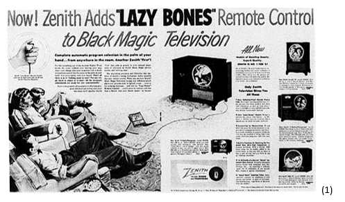
Let’s take a moment and give props to Eugene Polley, the father of the remote first introduced in 1950. And let’s give props to the folks on Zenith’s marketing team for having the clairvoyance to fully understand the lasting benefit of this remarkable device by naming the very first remote “Lazy Bones” (1). Nailed it!
Form follows function:
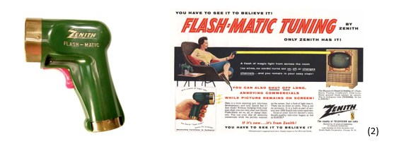
We generally recognize that most early remotes were rectangular boxes to house the controls. Oddly enough, when Zenith introduced the first wireless television remote control that hit the market in 1955, it took the form of the point-and-shoot Flash-Matic; a green ray gun looking contraption with a red trigger (2).
That single button offered a variety of functions depending on where on the TV you aimed. Not only did it change channels but it also “shut off annoying commercials” (more props to Zenith’s marketing team!) It reflected an early attempt to understand how users might interact with this new technology and what form factor should be considered. From there things became a bit more utilitarian. Most major brands expanded to offer some nicely designed multi-button remotes (3). Back in the day these devices could add as much as $250 in to the price of a TV – that’s over $2,000 in today’s dollars.
Population explosion:
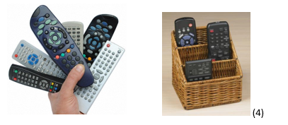
Many of us Gen-Xers remember the late 80s / early 90s when the remote control had become a commodity and every piece of home electronics shipped with some version of remote control. I remember as a teenager getting my first “decent” dual tape cassette, CD player, stereo / home theater. The receiver had a remote, the tape deck had a remote, the CD player had a remote, the TV had a remote, and the VCR had a remote. This phenomenon spawned niche market categories that would inevitably end up as someone’s white elephant gift for the holidays…the remote caddy (4) or better yet, the universal remote (we’ll get back to this gem later).
With the proliferation of remotes across all these devices, you’d think designers would have paid some attention to them, but being such a commodity, they were overlooked and added merely to check a box on a list of marketing features. Designed from a manufacturer’s dream, they had become plastic boxes with a circuit board, and an ever-increasing array of buttons for each new function. At this point, marketing got involved and added more buttons… and more buttons… and more buttons, until every function on the device was accessible from the comfort of your couch. These early ancestors could have been the evolutionary branch towards a more user-friendly product. Unfortunately, the mold was set for boxes with buttons delivering the latest conveniences for the budding couch potatoes.
Now, with a proliferation of remotes, the aftermarket seemed to notice that all these remotes were becoming a problem, so they said, “Why not offer users a single remote that could control all of their devices?”. Enter the universal remote. Imagine all the functions of all these devices consolidated into one remote. Problem solved! When I look at this thing, I’m wondering when they parted out the control panel for the space shuttle (5).
Emergence of Ergonomics:
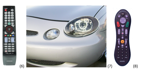
There finally reached a point where users said, “There are too many buttons! How do I use this thing?”. This issue eventually caught someone’s attention and design and usability were re-introduced into the equation… briefly. It was a moment in the evolutionary design process where industrial designers took an early step away from the primordial pool of “form following function” to that first step on solid land of ergonomic design based on comfort and ease of use. By adding color, clustering buttons and functions together, and changing the shape of a couple of the most important buttons, users would surely understand things… Right? Hey, these are early days of user centered design (6). By the mid-90s manufacturers were becoming more comfortable with molding curved objects (7) and remotes got some curves (8). Were these curves for styling, ergonomics, or both? Yes. Keep in mind the early 90s was a hot bed of ergonomic studies brought to light by repetitive stress injuries like carpal tunnel syndrome resulting from prolonged use of keyboards. Every designer was focused on how and where to improve ergonomics for devices used over prolonged periods, and what gets more prolonged use than our beloved TV remote?
The benefit of this tectonic shift in design focus was that designers were realizing the remote was not a mere commodity item. It was, in fact, the primary interface between the user and the brand, and it needed to deliver a positive experience.
User Centered Design:
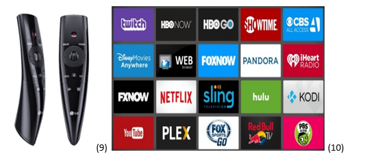
It wasn’t until the early 2000s that ergonomic design really started to infiltrate this category in earnest (9), producing designs that are becoming not only pleasing to look at, but don’t have a proliferation of buttons to scare users away, and may in fact fit your hand! Fast forward to today (no pun intended), and we know that all products, especially those which foster the brand to customer relationship are the recipients of thorough user centered design practices. They are focused on delivering the most positive experience possible, anticipating users’ needs before they do, and offering a solution that simplifies complexity. Remotes still offer the latest technology for the ultimate in sit-on-the-couch convenience, but they are not nearly as draconian. They are evolving to beautiful objects of minimalistic interaction. They work seamlessly (for the most part) with on-screen menus to help navigate the growing world of entertainment.
It is ironic that the most complicated remotes of the 90s and 2000s managed far fewer channels than we have today, yet today’s remotes are far easier to use. This is a good thing to reflect on as it relates to the evolution of the user centered design process. Although we are still focused on cost and manufacturability as development criteria, we are more cognizant of how technology is presented to users to support intuitive ease of use. The remote is a great retrospective of this transformation.
Moving forward, the remote continues its evolutionary path to that of an interface bridge between the user and the channel menu. The complexity is now managed at the UI app level (10), where interface improvements can change and adapt more rapidly, allowing much simpler interface at the remote level. With all the simplification occurring, I wonder if we will soon see the green Flash-Matic remote re-introduced to fully bring this all around?


